Showing posts with label dashboard. Show all posts

Wednesday, July 25, 2007

Cognos 8 College Dashboard

Here's another example of a dashboard (or should I rather call it a scorecard?), developed by me using a Cognos 8 dimensionally modeled framework and Report Studio.

It is used by the management of an educational center to easily and quickly view the current status of the key performance indicators of the organization. Of course, the numbers used in this picture are entirely fictitious (albeit not unrealistic!).
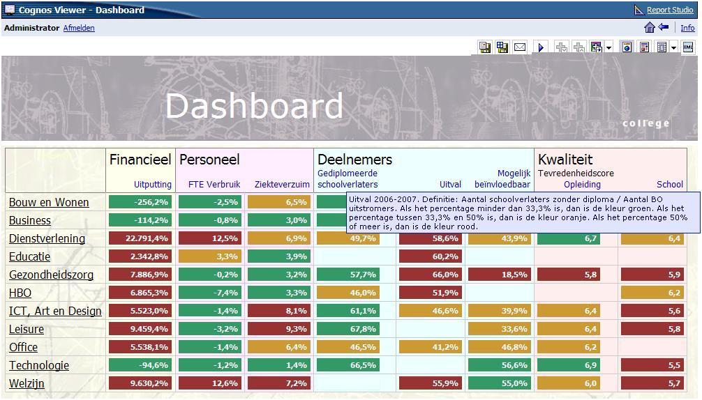

Feature highlights:
  • The framework consists of multiple dimensionally modeled star schema's, each with it's own regular dimensions. Common regular dimensions (i.e. the organization dimension) are related through relationships from each fact query subject to one central organization query subject.
  • The report makes use of multiple master-detail relationships. The organization dimension is used in the master query, and is linked to each organization level query item in the detail query. In the report example, most columns displayed are from separate detail lists. So the master query delivers the drill down capability through the organization, and the detail queries deliver the indicator information.
  • Coloring of the indicators is done by using conditional style variables.
  • When the mouse cursor is on one of the blue indicator names, a blue popup tooltip window appears containing both dynamic and static information. This is built by creating a report expression in an HTML item. The HTML item is an anchor tag <a> using the onmouseover attribute and some JavaScript code. Many thanks to Walter Zorn for sharing this piece of JavaScript! The report expression looks like this:

'<a onmouseover="Tip(''Uitval ' + [Detail Deelnemers BO uitstroom].[Schooljaar o.b.v. Specfieke peildatum] + '. Definitie: Aantal schoolverlaters zonder diploma / Aantal BO uitstromers. Als het percentage minder dan 33,3% is, dan is de kleur groen. Als het percentage tussen 33,3% en 50% is, dan is de kleur oranje. Als het percentage 50% of meer is, dan is de kleur rood.'')">Uitval</a>'

Wednesday, March 28, 2007

Cognos 8 Dashboard project

In this post, I'd like to share my implementation of a Cognos 8 Dashboard application with you.

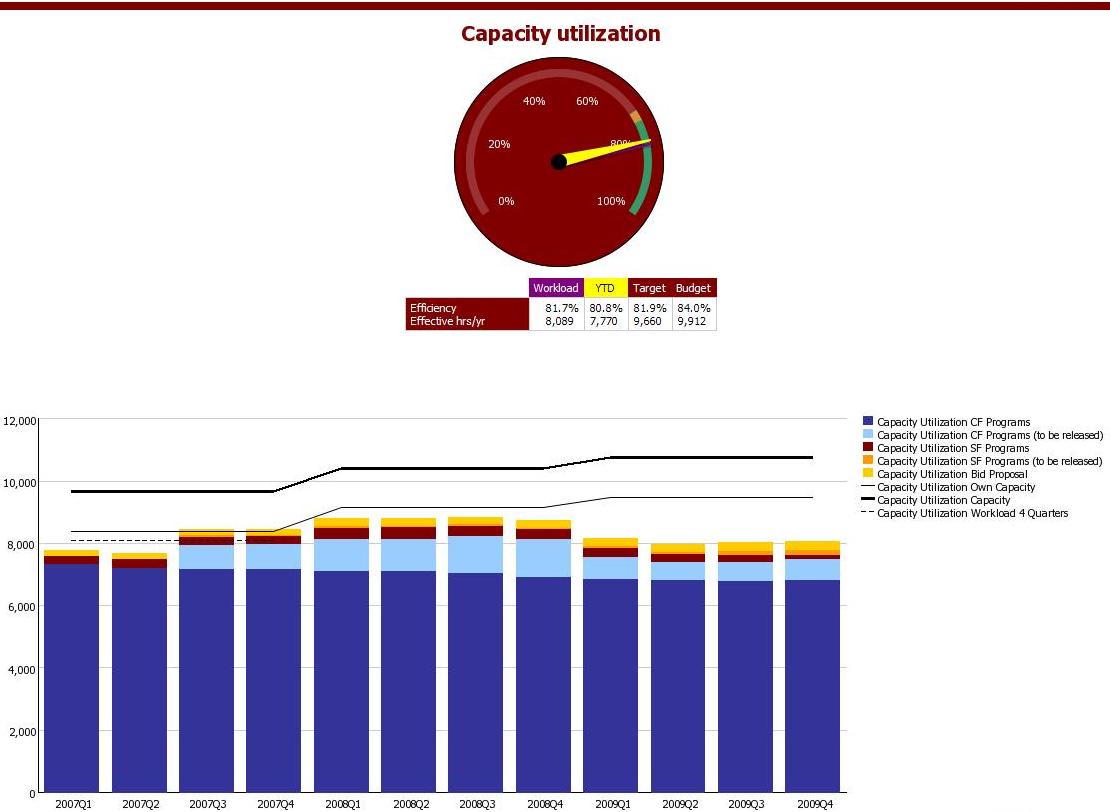
This dashboard application shows several Gauges and Charts, displayed both one Gauge and one Chart per page (see beelow) and several Gauges on a row (cockpit look):

One remark here: the Gauge Palette values indicating the red-to-orange and orange-to-green borders, are not dynamic but must be entered as static values in the report. This is annoying as these values are changing every year.

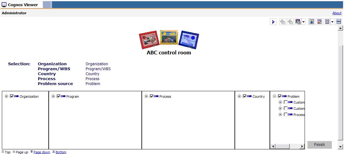
Filtering
The application also offers filtering possibilities for the most common dimensions. These filters are not built in the prompt page but in the first page and also below the charts and graphs, so it's easy for users to filter what they want in a compound and multi-level way using a tree prompt for each common dimension:

PowerPlay cube
The data is queried from a single PowerPlay cube, so dimension sharing among the measures is guaranteed! I've chosen to create a PowerCube for this application in order to speed up quering (as data is already stored as aggregates in the cube, this should be performed really fast). The PowerCube is created as just simple data source of type PowerCube in Cognos 8, and this data source connection is all what's needed to publish the Package from Framework Manager.

Transformer model
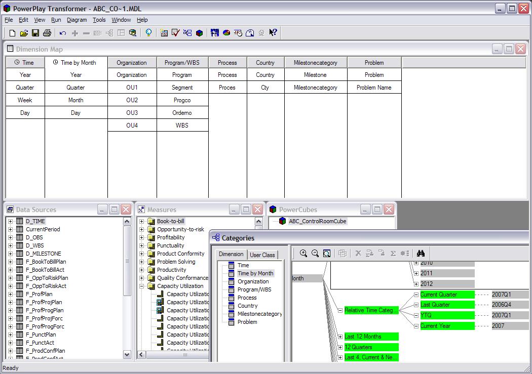
The PowerPlay Transformer model looks like this:

The table queries are stored in a data warehouse database and are designed really simple (star schema design), so manual SQL queries have been used here as feeders to each Transformer model data source.

There's just one drawback using this PowerCube data source approach. You can only refresh the PowerCube file when there's no connection to it. This means that either
  • the Cognos 8 service must be stopped entirely (which should be no problem outside office hours), or
  • the cubeswap script must be executed, which alters the data source connection to another cube file (see <Cognos 8 install location>webappsutilitiescubeSwap)

I'm really looking forward to see PowerPlay's Transformer OLAP designing and cube creating technology being integrated with Cognos 8 Framework Manager, as this would further reduce Cognos tool complexity. Although it's currently not really complex in comparison to Business Objects...

Final navigation path implementation

As it appeared to be impossible to implement a navigation path the way I wanted to (using the browser's history back function, see my previous post), I've decided to create a limited but robust alternative using the javascript exit function. It's limitation is that the user can only junp back to the previous page (report), and not to pages higher (more to the left) in the path.
Therefore I've created a piece of javascript code just for the last entry in the navigation path, and created a hyperlink only for this entry ('Marap' is the name of the previous page):

<a href="javascript:exit()">Marap</a>


Of course, the user is always able to use the browser history to go back to prior pages by clicking on the Go Back drop down button in the browser's navigation toolbar!

Tuesday, January 30, 2007

Implementing a navigation path

The Dashboard application, as of I blogged before, contains a navigation path ('kruimelpad' in Dutch).

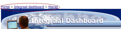
The navigation path is a series of one or more hyperlinks showing the path of reports a user has run from the Portal via the Dashboard down to the Monthly reports ('Marap') and the Trend graph reports.

The path is presented as one line in the top of the report and looks like this:


Each hyperlink in the navigation path consists of an HTML item object in the report. The '>' signs are just text item objects.

The HTML item contains an anchor tag calling the browser's page history and skipping a number of pages back.

For instance the link to 'Marap' looks like this, calling the history two pages back (-2):

<a href="#" onclick="history.go(-2);return false;">Marap</a>

Why two pages back and not one? Well, when Cognos executes a report, it will show an intermediate page "Your report is running." as long as the report is not ready and you're waiting for it. This page needs to be skipped when navigating back, so I don't go back one page but two.

In case of the prior run reports 'Integraal dashboard' and 'Portal', the same code is used, but instead of -2, the number of pages back is -4 and -6 respectively.

The main drawback of this technique is that Cognos does not show this page when the report can be run very quickly, so in that case the history call should be only one page back. For this potential issue, I have not found a solution yet.

I don't want the report to be re-run, as this is not user friendly in my opinion. By the way, a re-execution of the prior report would be possible using the following code:

<script language="javascript">
function exit()
{
document.formWarpRequest.method.value = 'release';
document.formWarpRequest.m.value = 'portal/report-viewer-release.xts';
setTimeout("document.formWarpRequest.submit()", 1);
}
</script>
<a class="ccOptions" href="javascript:exit()">Marap</a>

If someone knows of a way to elimininate the intermediate "Your report is running." page, please let me know! Cognos offers no solution for this as fas as I know.

Monday, January 29, 2007

How to automatically select the first prompt value

In the dashboard application I blogged about in the previous post, I now have added a prompt in the main portal report page showing the current period. When a new year arrives, the users often don't just want to see the few actual details if the new year, but also want to look back into the details of last year. This requirement calls for a prompted list of values.

Here is a screenshot of the actual prompt (red circle). The first value ('2007 t/m januari') is automatically selected. Mind there is NO prompt page! This is the first 'report' page that is presented to the user.


In Cognos it is possible to provide a Default Selection but this contains a list of static values. I cannot use this a each month there is another first value to be selected. So what I've created is a Value Prompt object presenting its values by a query with Use Values and Display Values, and have added an HTML item with a piece of JavaScript that selects the first value. The HTML item is added just after the Value Prompt object.

The JavaScript code in the HTML items looks like this:

<script type="text/javascript">
function init()
{

if

(document.formWarpRequest._oLstChoicesPeriode.options[3].selected == false)

{

if

(document.formWarpRequest._oLstChoicesPeriode.options[2].selected == false)

{

document.formWarpRequest._oLstChoicesPeriode.options[2].selected = true;

listBoxPeriode.autoSubmit();

}

}
}
</script>
<body onLoad=init()>


The first value to be selected in the list is actually the second value in the list object, which JavaScript sees as a list of three values in total. If no value is selected initially (third and second selections are false), the second value is selected by the script.

Tip: Did you know that the Cognos role "Consumers" needs to be given read permission to the Report Studio capability "HTML Items in Report" in order to get HTML item objects working in reports for Consumers? Please mind this and check the Tools > Capabilities in Cognos Connection!

Creating a Dashboard application as an hierarchy of reports

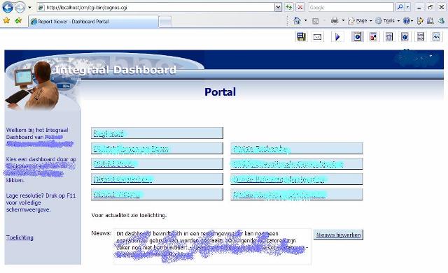
One of my projects last year, has resulted in a dashboard application as a hierarchy of ReportNet reports, making it easy for users to locate and view Key Performance Indicators, perform drill through operations et cetera. The main page of this application looks like this (sorry for the blur, it is needed to respect my client's privacy):


In the large white box (blue brushed) you see the latest news, which the administrator can update using the button next to it! Actually, this update button calls another ReportNet report, starting with a prompt that is passed to a stored procedure in the database. This stored procedure performs the record update.

The large buttons act as hyperlinks. The button text is derived from an item in a query retrieving organizational unit names.

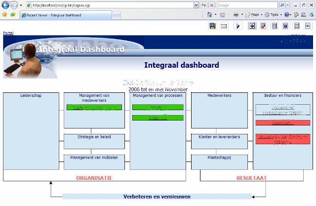
Each button drills through to a common ReportNet report containing high level KPI's colored red, orange or green, something like this:


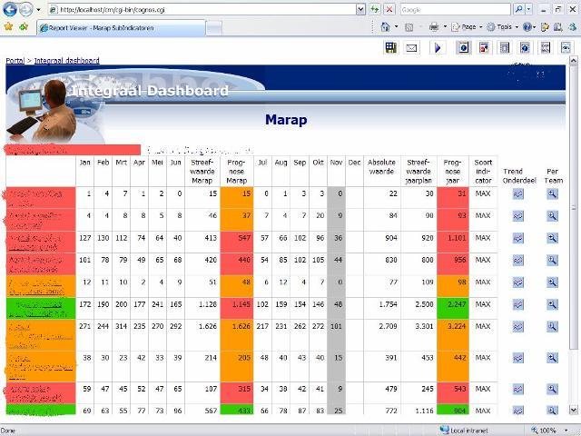
Each high level KPI is not only an indicator, but also a drill through to a report showing the low level indicators by color, including its achieved values by month and the forecast values:


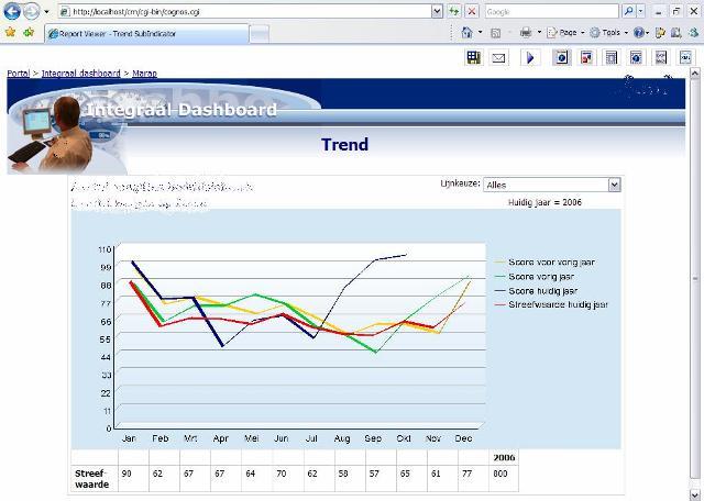
This 'Marap', or Monthly Report, contains small buttons for drilling through to reports for organizational Monthly Report breakdown and graphs:


Other characteristics of this hierarchical approach:
  • Users are provided with a URL (which has also been published to the client' s intranet) eliminating the Cognos Connection header, resulting a clean interface;
  • The user's path through the report structure (in Dutch it is called 'kruimelpad') is displayed at the top of every report page and contains links back to previously opened reports.

I plan to reveal the technical details of each of these characteristics in upcoming blog posts. But for now, it's only to show you an approach to creating easy-to-use dashboard applications.