This dashboard application shows several Gauges and Charts, displayed both one Gauge and one Chart per page (see beelow) and several Gauges on a row (cockpit look):
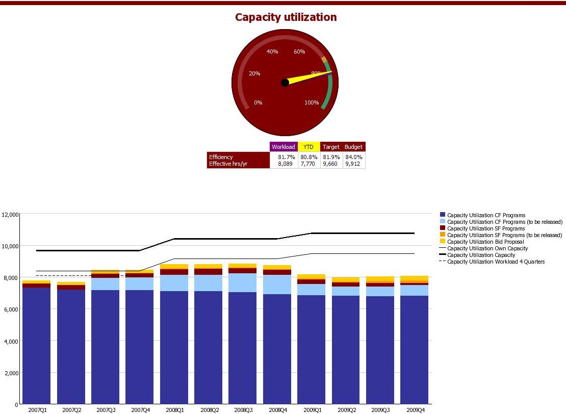
One remark here: the Gauge Palette values indicating the red-to-orange and orange-to-green borders, are not dynamic but must be entered as static values in the report. This is annoying as these values are changing every year.
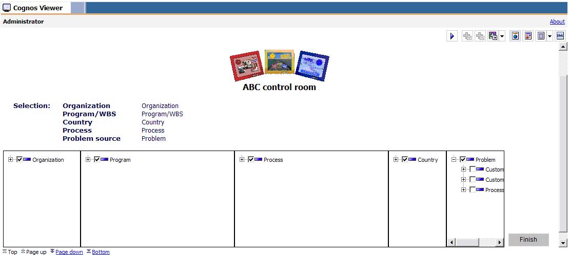
Filtering
The application also offers filtering possibilities for the most common dimensions. These filters are not built in the prompt page but in the first page and also below the charts and graphs, so it's easy for users to filter what they want in a compound and multi-level way using a tree prompt for each common dimension:
PowerPlay cube
The data is queried from a single PowerPlay cube, so dimension sharing among the measures is guaranteed! I've chosen to create a PowerCube for this application in order to speed up quering (as data is already stored as aggregates in the cube, this should be performed really fast). The PowerCube is created as just simple data source of type PowerCube in Cognos 8, and this data source connection is all what's needed to publish the Package from Framework Manager.
Transformer model
The PowerPlay Transformer model looks like this:
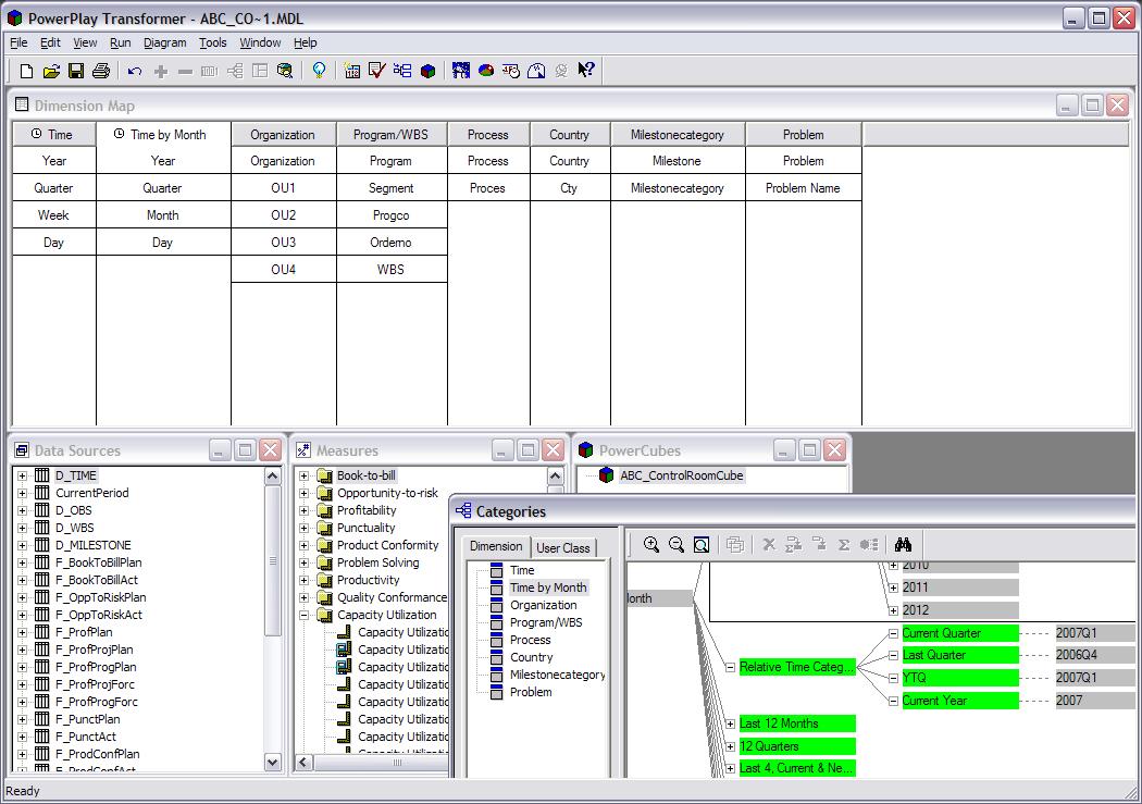
The table queries are stored in a data warehouse database and are designed really simple (star schema design), so manual SQL queries have been used here as feeders to each Transformer model data source.
There's just one drawback using this PowerCube data source approach. You can only refresh the PowerCube file when there's no connection to it. This means that either
- the Cognos 8 service must be stopped entirely (which should be no problem outside office hours), or
- the cubeswap script must be executed, which alters the data source connection to another cube file (see <Cognos 8 install location>webappsutilitiescubeSwap)
I'm really looking forward to see PowerPlay's Transformer OLAP designing and cube creating technology being integrated with Cognos 8 Framework Manager, as this would further reduce Cognos tool complexity. Although it's currently not really complex in comparison to Business Objects...
9 comments:
Your gauge looks very good indeed. How do you manage to format the percents so nice?
Cheers!
I figured out how you actually did this: in the gauge palette you added 3 red 1 yellow and 1 green. Very nice trick!
Thanks!
you're welcome!
Hi,
Are you able to tell me exactly how you did the first gauge?
The data a I have actual and budget figures. I would like to make the Budget figure equal to 100% and then have the one needle representing the actual figure.
Any help would be great!
Thanks.
Try this (in Cognos 8.3): create a query Query1 in a new Report. Then, paste the Clipboard Fragment content from the file 'gauge_example_xml' you can find here in the report page layout to see the gauge I have used inclusing all properties. To complete it, you should provide the correct query items in both he query enad the gauge object.
Hope this helps!
Regards, Marc
hi,
i have just figured your blog.
Tnanks for the ideas and you create many questions to be answered.I am working with Oracle Bi but i have to deal and with Cognos..
I have a question.Is it possible to guide us for the prompts (report analysis - dashboard) and if it is possible to make a logical column such as rcount(1)....?from report studio?
Is it possible to make time calculations in transformer?
Any pdf,ideas are welcomed..
tnks in advance
Certainly it's possible to do counts in Report Studio, just make use of the summary function "count()". Put any expression (e.g. a number) between the function brackets ().
Time calculations can be made in Transformer, by adding relative time categories in the time dimension category diagram. A lot of relative time categories are instanly available when you create a date dimension from the wizard, e.g. YTD (Year To Date) and LTD (Life To Date).
Check the user guides for more info...
I can't view those images.:(
Post a Comment