Recently, I've been in close development with one of my Cognos customers to create a flexible and simple report for analysis of changes in prospect forecasting, called Bridge Analysis. Unfortunately, I cannot share a complete example of this report with you (because of company confidentiality), as this would have a far better look, with logo's, category names and definitions, selected prompt values et cetera. On the other hand, this makes it much better to focus on the heart of the matter.
The Bridge Analysis report, developed in Cognos BI 8v3 Report Studio, contains:
- a Prompt page to select starting snapshot (first pillar or the bridge), ending snapshot (usually the running forecast, as last pillar of the bridge), and various other value prompts for filtering on prospect characteristics
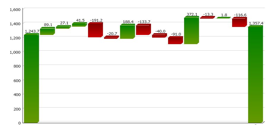
- the Bridge page showing a cumulative column chart (see below) with first and last pillar, and various change categories in between
- a Legend page explaining the used categories containing dynamic descriptions (query items)
- a Page group for all change categories, with one subsequent page displaying a list of top 10 prospect details in descending absolute order of change; the sum of changes in each prospect page totals into the bridge chart category column height, being positive (green) or negative (red)
Bridge Analysis
There are some tricks techniques used in this report:
- The right side pillar is not a regular chart column, but is a Total column, enabled via the chart properties. I've used this on purpose, because a regular column would have to be calculated as a negative value in order to enable movement downwards to zero on the Y-axis. If I had used a regular column to show the right side pillar, this would have resulted in a negative value notation on top of the column, and the column color would have been red. A Total column on the other hand, has it's own color defined (green, as well as the starting column). This rightfully reflects the total prospect values to be analyzed.
- Allthough multiple queries are used, the entire report is using one common prospect details query, delivering all relevant columns in one row per prospect. Other queries are defined on top of this detail query.
- A drill through has been defined in the Change Category column, to show the respective prospect list for the selected category.
- Change categories having no prospect value are excluded from the report, so only relevant categories are displayed in both the bridge chart and in the subsequent categories page group.
My customer is now happy to be able to easily present changed data in this very useful way, and I'm happy to be able to help him creating this powerful and flexible Cognos report :-)
23 comments:
Can't see the screenshot !!
That's strange, it may take a few seconds but then you should see the bridge picture (I tested it using Firefox and Chrome). If not, please post your email address in a new comment and I will email you the picture file in reply.
Hi,
That Bridge looks great!!!
Have you had a case where you had to control (set) the number of legend items displayed?
Is there a way to drill from a legend item ?
Thanks for your comment and compliment :-)
Each item in the legend represents one change category, i.e. one of the intermediate (floating) bars between the left and right side pillars.
These categories are defined in one single calculated query item. Thus, I by changing the definition, I can easily control the number of categories. In addition, only categories having any values are filtered in the query.
Drill through from the legend item is implemented by a drill through on the Progressive Chart and targeting to a detail report and passing the respective category name.
Hope this answers your questions...
Hi Marc -
I am trying to implement Bridge Analysis chart But I am facing problem to get data in the form which I can use to create stack column chart. Have you done calculation on report level to get increase/ decrease in values from previous value or it has been calculated by Stored procedure? If you can send across technique to create this by mail.
Hi 'Smit',
The first pillar column and the subsequent floating columns have been defined in the same query item. The second pillar column is the Total Column (chart property).
So in essence a query with just one item containing the category name (for the x-axis) and one item containing the according value (measure) would be sufficient.
Hi Marc -
I do understand that but problem is to calculate data which is displayed in chart. I have first piller data and last piller data and absolute values for intermediate values on x axis. It would be better if you can share report spec with me so that I can try to implement that in my scenario.
I mean problem in calculating measures
I see. I'll try to post a link to a sample report spec (xml) next week.
Many thanks...
Okey, here it is: a bare Bridge Analysis XML report specification: http://drop.io/mavawadrop/asset/ba-barexml-txt
(By the way, it's a Cognos 8v3 version)
Hi Marc -
Thank you for providing report spec but it seems some problem with the URL you have provided!! after I click on this URL it doesnot show any specs or there is no way to download report specs.
oops... now the link above should work
i see that each bar has it's own color (green or red). i've got a similar bar chart that i'd like to conditionally render the color of the expense bar if it is greater than the amount of the budget bar. how can i acheive this?
Hi Brad,
In version 8v3 a Conditional Palette can be set on the Progressive Chart, to show the colors based on a variable. I think this should help to solve your problem (though i have not tried it yet).
Marc,
I am not sure how you changed the right column to a "total column" using the chart properties. I have to aggregates set to total, is this what you mean? I still don't seem to have the ability to change the color on just the last column. Thanks much!!
Marc,
Disregard the last question. I was able to locate the total column property! Thanks for the great example! Exactly what I needed to fix my chart! Happy New Year!
That's exactly what I meant.
Happy New Year to you too!
Marc,
I need to create a bridge analysis that includes columns for revenue, variable margin and operating profit (with all the costs in-between). So, all 3 of these columns would start at zero (so, it is like yours, except an extra column in the middle). The only way I have been able to make this work is to create 2 charts...the first goes from revenue through to the cost that get you to variable margin. The second chart starts at variable margin and the revenue column is a total column of variable margin less the costs. The problem with this is that there is no way to put the charts right up against eachother to make it look continuous. Do you have any ideas how I might get this on one chart? I could do in Excel b/c you can trick it to do anything...but Cognos is a different story! Thanks so much!
Wow, that's quite a long bridge you'd want to build. Unfortunately I don't see any options to develop a three-pillar bridge using Cognos' Progressive Chart object...
Maybe anyone else has a clue?
Thats a very nice bridge analysis report Marc. Just wondering if you have any sample XML for 8.2. Cheers!
Thanks for your compliment.
I've built this report in 8v3 and then upgraded it to 8.4.1. So I don't have a 8.2 version for you. I guess you'll have to build in the various elemente yourself. See it as part of your learning path;-)
The drop.io link stays unavailable.
New XML report specification download location
Post a Comment