Actually, the reporting solution for this customer consisted of several dashboard reports, one for each type of manager. Each dashboard shows up to 6 charts (one per KPI). Clicking on a chart runs a KPI report like you've seen in the prevous post, containing the button list of measures as well as the "Go to Analysis Report" link. Clicking on this link runs a commonly defined Analysis Report.
The Analysis Report:
- is a generic Report Studio type report called from every specific KPI-report
- receives the specific KPI value as a parameter value
- was developed to deliver basic analysis capabilities to the manager, licensed for not more than the Consumer role
- displayes a crosstab specified by the user
- features limited row and column selection options, including filtering
- offers only the dimensions and measures relevant to the passed KPI, thus being "Contextual"
This report enables the manager (a Cognos Consumer user) to perform some analysis on his business performance without having to use Analysis Studio. This not only reduces the TCO (because no Business Analyst license is needed), but it also relieves the burden of having to learn another user interface with more functionality than strictly needed.
In this project, 30 KPI's were developed. All of these were included in the Measure Dimension Matrix. Each KPI related to one group of measures (resulting in about 120 measures including regular and calculated measures). However, not each measure group relates to a dimension. So it was a rather mixed matrix with moderate scarcity (i.e. empty cells). (Besides that, not all related measures were bound to the same lowest level of any dimension. This is however neatly resolved by scoping the dimension levels in Cognos Transformer.)
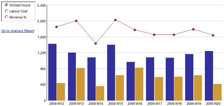
The Analysis Report looks like this. It's an example of KPI01 having 6 dimensions related to it. Mind that the total Multi Dimensional Model (MDM) consists of 25 dimensions and 30 KPI's. Using render variables each KPI-parameter is evaluated and the relevant prompt is shown or hidden. Note also that so many dimensions and measures in the model will make this a heavy report, as it will contain a lot of code!
 |
So the report opens up with the prompt page offering prompts for selection of:
- a primary and secondary dimension to be displayed in the outer and inner rows of the crosstab (only the dimensions related to the KPI!)
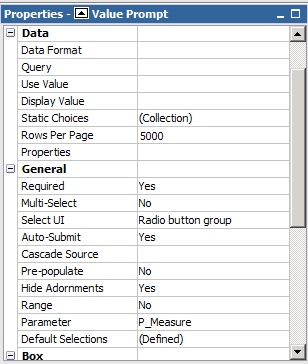
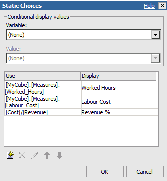
- a measure within the group of measures the specific KPI represents
- a period of time to be displayed in the columns of the crosstab
- additional filtering (optional) of items of the related dimensions
When the user finishes the prompt pages, the report runs resulting in a crosstab. The prompts are shown in the top half of the report page itself for immediate adaption by the user (Auto-submit).
 |
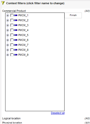
Toggling of Tree Prompts
Aside from the contextual features of this report, a technique has been applied to toggle display of the optional prompts.
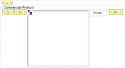
The optional filter prompts in both the prompt page and the report page are Tree Prompt objects. They appear as soon as the user clicks a dimension. Here, some HTML Items containing JavaScript code, <a> and <div> tags are used to toggle display of the prompts.
 |
These items are:
1. at the start of the page, an HTML Item containing the code:
<script language="javascript" type="text/javascript">function toggleDiv(divId) {var theDiv = document.getElementById(divId);if (theDiv != null) {var divStyle = theDiv.style;divStyle.display = (divStyle.display == "none" ? "block" : "none");}}</script>
2. before the dimension filter link, an HTML Item containing the code:
<a class="togglePrompt" href="javascript:toggleDiv('prompt_Product');">
3. after the link and before the tree prompt, two HTML Items containing the code:
</a><div id="prompt_Product" style="display:none;">
4. after the tree prompt, an HTML Item containing the code:
</div>
It looks like this for each dimension filter: